
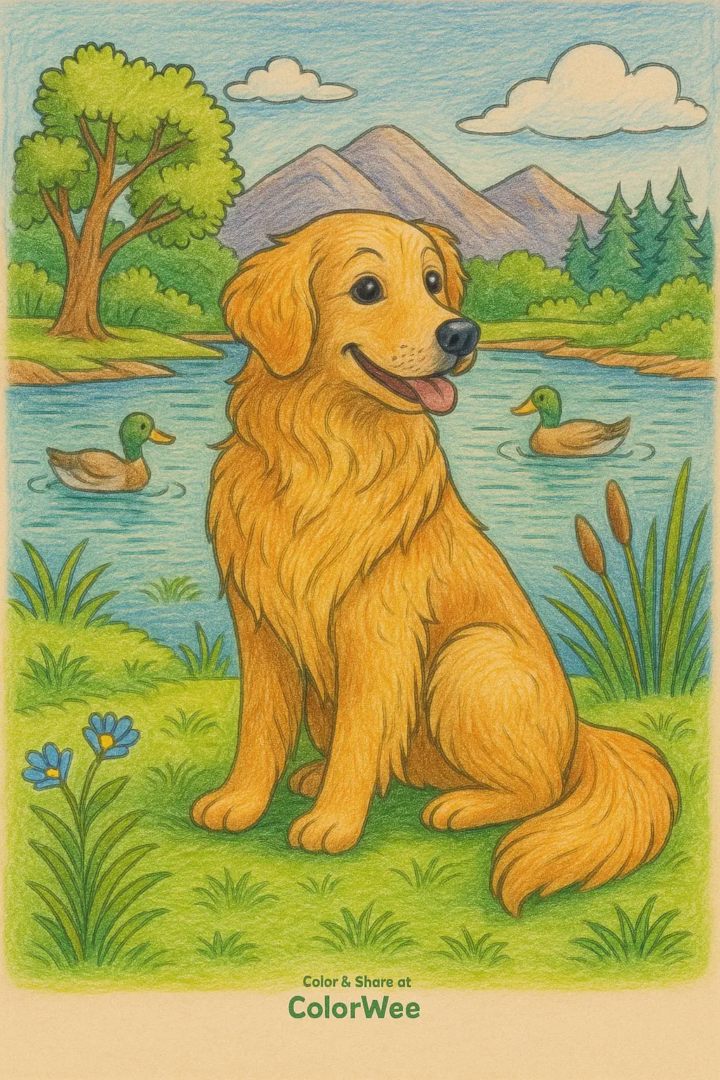
 To make coloring look good, focus on smooth color, simple shading, and a limited palette. You do not need expensive pencils or complicated techniques to make a coloring page look polished.
Start with light pressure. It is easier to add more color than to remove a dark mark. Build the color in several light layers instead of pressing hard from the beginning. This usually gives a smoother finish and makes streaks less visible.
Use darker shades near edges, folds, and places where one object overlaps another. Keep the center of rounded objects lighter to make them look more three-dimensional. Even basic shading can make a flat coloring page look much better.
Choose your colors before you start. A small palette often looks cleaner than using every color available. You can use different shades of the same color or combine a few colors that work well together.
For colored pencils, blend layers gradually and use a lighter pencil to soften transitions. With markers, work quickly across larger areas so the ink dries evenly. Putting scrap paper underneath the page also helps prevent markers from bleeding onto the next sheet.
Do not worry about filling every area with complicated effects. Clean edges, consistent pressure, and a few well-placed shadows usually make a bigger difference than adding lots of detail.
Learn more: What are some fun coloring ideas for adults?

